CPR+ Banner displaying the look of the app
Laemmle Logo Redesigned

Overview

Help people learn CPR

The Laemmle theater aims to attract new generations to its independent and foreign film offerings while catering to its usual customers. To accomplish this, they are developing a user-friendly, accessible website that can be used on various devices. The website will allow customers of all ages to easily reserve seats for a smooth, hassle-free experience at their theaters.

The Laemmle theater aims to attract new generations to its independent and foreign film offerings while catering to its usual customers. To accomplish this, they are developing a user-friendly, accessible website that can be used on various devices. The website will allow customers of all ages to easily reserve seats for a smooth, hassle-free experience at their theaters.

Image of a person's hand holding a phone and using CPR+ app

🗓  Project Duration

APRIL TO MAY 2022

Problems

👵🏼

Problem 1

The movie theater's website faced issues and was not effectively engaging its older customers through its seat reservation system. Despite the interest of a diverse range of ages in visiting the movie theater, elderly moviegoers may face difficulties using technology, particularly regarding website accessibility. 

These difficulties included:

  • Difficulty reading small text or low contrast on the website, making it hard to understand the information.

  • Difficulty remembering how to use a website or understanding the reservation process, making it hard for them to complete their reservation.

  • Less patience for confusing or slow technology may lead to them giving up on the website or application if they encounter difficulties.


🍿

Problem 2

Other critical issues that were affecting users include:

  • Complicated or confusing website layout, hindering users from finding necessary information or completing the reservation process.

  • Poor mobile device optimization makes it challenging for users to complete reservations on their smartphones or tablets.

The Goal

Create a website that adjusts to different devices and addresses issues of low engagement among users of different ages by using a clear, engaging, and easy-to-use layout for a seamless experience.

Create a website that adjusts to different devices and addresses issues of low engagement among users of different ages by using a clear, engaging, and easy-to-use layout for a seamless experience.

Role

👩🏻‍💻

UX/UI Designer

Led the design process from the initial research phase to the final delivery.

📝

Responsibilities

  • Conducted user research to understand the needs and pain points of the target audience

  • Defined user personas and scenarios

  • Created low-fidelity wireframes, high-fidelity mockups, and interactive prototypes to visualize the user interface and user flow

  • Defined and organized the information architecture, creating an intuitive and easy-to-navigate structure for the users

  • Ensured accessibility and responsiveness of the app, including design for different devices and screen sizes

The User

Gif of User Personas

Summary

I gathered information about my users through interviews and created empathy maps to understand their needs, wants, and pain points.

Summary

I gathered information about my users through interviews and created empathy maps to understand their needs, wants, and pain points.

Empathy Map Image, User Says, User Thinks, User, Does, User Feels

The primary target audience is older individuals who enjoy going to the movies. They desire the ability to reserve seats and book tickets in advance through the movie website to avoid waiting in line.

The primary target audience is older individuals who enjoy going to the movies. They desire the ability to reserve seats and book tickets in advance through the movie website to avoid waiting in line.

A secondary audience analyzed are individuals who want easy access to movie information and the ability to quickly book seats and purchase tickets on various devices without disruptions caused by confusing layouts or poor mobile experiences.

A secondary audience analyzed are individuals who want easy access to movie information and the ability to quickly book seats and purchase tickets on various devices without disruptions caused by confusing layouts or poor mobile experiences.

Graphic of Empaty Map for one persona

Personas

👨🏼‍🦳

Persona 1
Miguel Lopez

Age: 64

Education: M.A. in Architecture

Hometown: Los Angeles, CA

Family: Married, No kids

Occupation: Architect

"The website is not intuitive to use, and I struggle to navigate it. Going in person and standing in line is easier for me, but I sometimes miss the chance to select good seats."

Problem Statement

Miguel is a retired senior who wants to be able to select seats and purchase tickets online in advance, as he does not want to stand in line at the theater and risk not getting the seats he wants for himself and his wife.

🏋🏽

Goals

  • Attending movies during weekdays when there are fewer crowds

  • Would like to book tickets in advance and choose the best seats for their movie from home

🤦🏼‍♂️

Frustrations

  • Struggles to navigate the site

  • Sometimes, we arrive at the theater and find the good seats already taken, which is frustrating

  • I am anxious about getting to the theater early

👱🏼‍♀️

Persona 2
Luzia Smith

Age: 26

Education: B.A. in Film

Hometown: Los Angeles, CA

Family: Single

Occupation: Student

"The website is not intuitive, and I have trouble finding the necessary information. The navigation process is not as smooth as I would like."

Problem Statement

Luzia, a full-time film student, wants to be able to pick independent films and book seats for herself and her friends using her phone so she doesn't have to waste time and miss the start of the movie.

🏋🏼‍♀️

Goals

  • Purchase tickets in advance using any device she has available 

  • Choose her preferred seats and purchase snacks if possible, through her phone 

  • Receive notifications of the exact start time of the movie

🤦🏼‍♀️

Frustrations

  • Navigation is challenging 

  • Trouble quickly finding the movie she wants to watch 

  • Faces difficulty in selecting an available seat on her mobile phone 

  • Runs out of time to buy snacks before the movie starts

Competitive Audit

Competitive
Audit

Competitive
Audit

I performed a competitive analysis of various websites in the same category, focusing on their navigation, layout, and overall design. Additionally, I evaluated the ease of use and effectiveness of each website's features and functionality.

I performed a competitive analysis of various websites in the same category, focusing on their navigation, layout, and overall design. Additionally, I evaluated the ease of use and effectiveness of each website's features and functionality.

Landmark Theatres Logo

Landmark Theatres

Landmark Theatres is a company that offers a diverse range of films, focusing on independent and foreign films.

The desktop website has several strengths, such as quick access to buying options, a responsive design, and clear steps for seat selection. The home page offers a quick buy menu to select the theater, a brief overview of what is playing and coming soon, and discounts. The seating selection works, although it could be improved.

Additionally, the website allows users to add their information and see how much they will pay and their seat before purchasing. However, there is still much information to scroll through.

The mobile website also has some issues when selecting a seat and is not as responsive as it should be. The website's navigation is straightforward, and the color interface helps engage users while looking for information. While the brand identity is good, the website could benefit from having less content. The tone is friendly and engaging, but it is missing an intro or welcome message. While the navigation is straightforward and easy to use, the website could benefit from having less content. The website can also improved in terms of accessibility and user flow.


The Art Theatre Logo

The Art Theatre

The Art Theatre's website has a complex and busy design. The content is not well-organized. The website is responsive, but an app would significantly enhance the mobile experience. In terms of features, the website offers a clear overview of current and upcoming films and information about the theater. However, it lacks interactive features such as trailers and reviews, which would significantly enhance the user experience.

The seat selection process is not very intuitive and could be improved. Additionally, buying tickets could be made more streamlined and easy to understand. Overall, while the option to select seats and buy tickets is available, the user experience is not very smooth and could be significantly improved.

Regarding accessibility, the website is busy, and some colors and buttons have a low contrast making it hard for people with low vision. Overall, while the Art Theatre's website has some strengths, such as its simple design, but it could benefit from organizing the information, interactive features, and accessibility enhancements to improve the user experience. A mobile app or better responsive design would significantly enhance the mobile experience.


CFV Cinemas Logo
CFV Cinemas Logo

CGV Cinemas

CGV Cinemas' website offers a clean design that is easy to navigate. The website is responsive, allowing users to access it on any device. The layout is consistent across all devices, making it easy for users to find what they are looking for, regardless of their device.

When a user wants to purchase tickets, they can easily search for a movie and select the desired showtime. The website then displays a theater seating chart, allowing users to choose their preferred seats. The checkout process is straightforward to use. Users are prompted to enter their personal information and payment details, and they can also choose to receive their tickets via email or as mobile tickets.

While the website is fully responsive, additional mobile optimization features such as larger touch targets and a simplified layout could improve the user experience on mobile devices.

Overall, the responsive design makes it easy to navigate and purchase tickets on any device, and the layout is consistent across all devices. The selection and purchasing of tickets are straightforward.

CPR & First AID App Logo

IPic Cinemas

iPic Theaters is a luxury movie theater chain that offers a premium movie-going experience. They offer a diverse selection of movies, including independent and foreign films and the latest Hollywood blockbusters.

The iPic Theaters website offers a user-friendly and visually appealing design that is easy to navigate. The website is fully responsive, which adapts to the device used, whether it's a desktop computer, laptop, tablet, or smartphone. This makes it easy for users to access the website and purchase tickets on any device.

When a user wants to purchase tickets, they can easily search for a movie and select the desired showtime. The website then displays a theater seating chart, allowing users to choose their preferred seats. The website also offers an option to book a luxury seat or a private screening room experience. The checkout process is easy to use. Users are prompted to enter their personal information and payment details, and they can also choose to receive their tickets via email or as mobile tickets. The website also provides an option to save the user's information for future purchases.

The website is also mobile-optimized, making it easy to use on smartphones and tablets. Users can purchase tickets, select seats, and access showtimes while on the go.


Ideation

A brainstorming technique called Crazy Eights is used to generate ideas to fill the gaps identified in the user personas and competitive audit. It emphasized that the website should have an easy-to-use interactive seating chart for users to select and reserve seats and a theater layout view. It should also be optimized for mobile devices with a responsive design for access on any device.

A brainstorming technique called Crazy Eights is used to generate ideas to fill the gaps identified in the user personas and competitive audit. It emphasized that the website should have an easy-to-use interactive seating chart for users to select and reserve seats and a theater layout view. It should also be optimized for mobile devices with a responsive design for access on any device.

Crazy Eights Brainstorm Drawing of ideas for the CPR app
Digital wireframes of
Digital Wireframes
Digital Wireframes
Digital Wireframes
Digital Wireframes
Digital Wireframes
Digital Wireframes
Digital Wireframes
Digital Wireframes
Digital Wireframes
Digital Wireframes
Digital Wireframes
Digital Wireframes
Digital Wireframes
Digital Wireframes
Digital Wireframes

A sitemap of the website's structure was developed to assist in the design process.

A sitemap of the website's structure was developed to assist in the design process.

Image of the website sitemap

Starting
The Design

Computer Image Gif

✏️

Digital Wireframes

Following the ideation and creation of paper wireframes, I developed the initial designs for the Laemmle responsive website.

Following the ideation and creation of paper wireframes, I developed the initial designs for the Laemmle responsive website.

Crazy Eights Brainstorm Drawing of ideas for the CPR app

📲

Low-Fidelity
Prototype

To prepare for usability testing, I created a low-fidelity prototype demonstrating how users can navigate the Laemmle website to select a movie, find seats, and purchase tickets.

To prepare for usability testing, I created a low-fidelity prototype demonstrating how users can navigate the Laemmle website to select a movie, find seats, and purchase tickets.

Image of Digital Wireframes

Usability Study

Parameters

📑  Study Type

Unmoderated

📍 Location

Los Angeles

🤳 Participants

5 Participants

⏳ Length

30-45 min

🕵🏻‍♀️

Findings

The usability study yielded the following key results:

Enabling CPR Guide

In an emergency, the ability to quickly and easily locate the CPR activation button is crucial.

In an emergency, the ability to quickly and easily locate the CPR activation button is crucial.

Emergency Call

During a CPR emergency, it is essential to have the capability of quickly dialing the emergency number while remaining able to view the steps in the guide without exiting the application.

During a CPR emergency, it is essential to have the capability of quickly dialing the emergency number while remaining able to view the steps in the guide without exiting the application.

Navigating CPR Steps

During an emergency call, users should have access to a quick overview of the initial steps to be well-informed and confident in performing CPR.

During an emergency call, users should have access to a quick overview of the initial steps to be well-informed and confident in performing CPR.

Refining The Design

Refining
The Design

Refining
The Design

📲

High-Fidelity
Prototype

Design modifications were based on the usability study results, which emphasized the need for an easy method of activating the CPR guide.

Design modifications were based on the usability study results, which emphasized the need for an easy method of activating the CPR guide.

Image of the Affinity Map
Image of Wireframes for the High- Prototype
Graphic of the final Mockup of the CPR+
Image of the High-Fidelity Prototype
Mockup graphic of before and after usability study

App Design

CPR+ App

Accessibility

Considerations

1️⃣

Alternative, clear labels and easily accessible options were available to users to navigate the app. Alt text was added to images, and color contrast was ensured to meet accessibility standards.

2️⃣

Simple navigation cards were implemented for easy swiping and category selection. Users have multiple options to return to the previous screen or main menu.

3️⃣

Effortless navigation was enhanced by incorporating icons and accessible audio during a call. Upon opening the home screen, users are immediately guided on how to initiate CPR emergency assistance in case of an emergency.

Responsive Design

Responsive
Design

Responsive
Design

Image of a Desktop Computer displaying the design of CPR+ website

Sitemap

After completing the app designs, I began designing the responsive website. The CPR+ sitemap was utilized to guide the organizational structure of each screen's design to ensure a consistent and cohesive experience across devices.

After completing the app designs, I began designing the responsive website. The CPR+ sitemap was utilized to guide the organizational structure of each screen's design to ensure a consistent and cohesive experience across devices.

Image of the CPR+ Website Sitemap

Website Responsive Designs
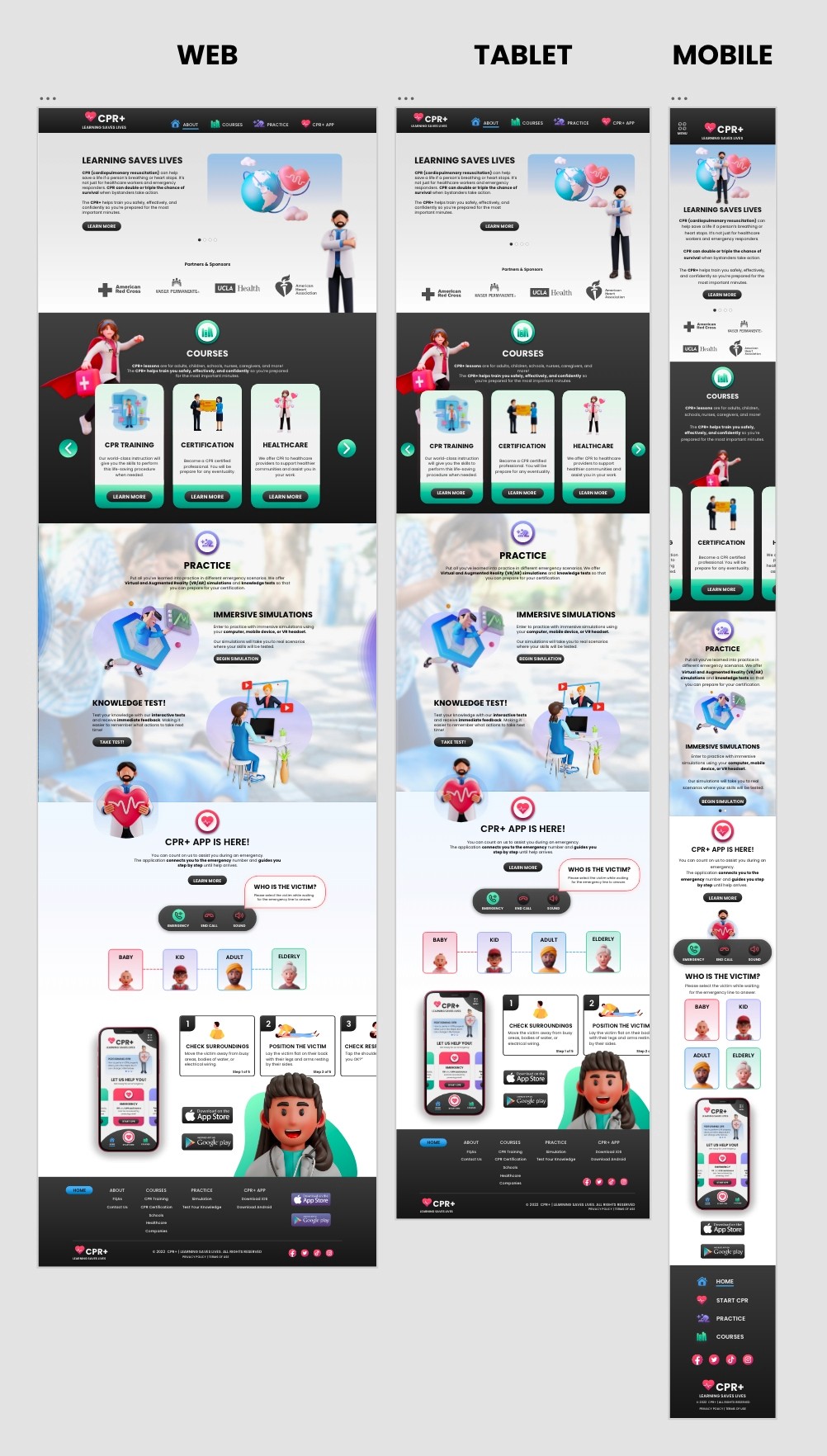
Designs were optimized for specific screen sizes and devices that users use, including mobile, tablet, and desktop. Variations were made to account for the different screen sizes.

Designs were optimized for specific screen sizes and devices that users use, including mobile, tablet, and desktop. Variations were made to account for the different screen sizes.

Image of the different website wireframes screens
Image of the different website screens

Website Design

CPR+ Website

Takeaways

Impact

Users reported that the CPR+ app made them feel more secure in an emergency. They felt more at ease knowing they could call the emergency number and still recall CPR procedures while using the app.

Users reported that the CPR+ app made them feel more secure in an emergency. They felt more at ease knowing they could call the emergency number and still recall CPR procedures while using the app.

Additionally, the responsive website design enabled users to learn various CPR methods through multiple media formats and easily access the website from any device due to the responsive design.

Additionally, the responsive website design enabled users to learn various CPR methods through multiple media formats and easily access the website from any device due to the responsive design.

Lessons

Learned

Gif of a character drawing a doodle

Throughout this project, I learned how to simplify problems and create valuable and engaging solutions for diverse users. The experience taught me the importance of putting myself in the user's shoes.

Throughout this project, I learned how to simplify problems and create valuable and engaging solutions for diverse users. The experience taught me the importance of putting myself in the user's shoes.

My design process emphasized the importance of patience as I carefully crafted a solution rather than just a simple design. It is hoped that the process and design outcomes will result in a product that can significantly assist many individuals during an emergency.

My design process emphasized the importance of patience as I carefully crafted a solution rather than just a simple design. It is hoped that the process and design outcomes will result in a product that can significantly assist many individuals during an emergency.

CPR+ Learning Saves Lives Logo

Next Steps

1️⃣

Conduct final research to evaluate the success of the app and website in achieving the goal of saving lives during a CPR emergency and teaching CPR on the go.

2️⃣

Include additional educational resources for pet owners to learn CPR procedures for their pets.

3️⃣

Offer digital badges and credentials for users who successfully complete accredited learning components.

Thank You!

for reviewing my work!

Thank You!

for reviewing my work!

CPR+ Banner displaying the look of the app